Best Way to Transform With 7 Living Room Paint Colors
Have you ever walked into a room and felt instantly uplifted or calmed by the wall color? The power of paint to transform a space is truly remarkable. Selecting the right living room paint colors can dramatically change the feel of your home’s central gathering space. Many homeowners struggle with choosing colors that reflect their personality while creating the right atmosphere. The challenge often lies in balancing trendy interior paint color ideas with timeless options that won’t feel dated in a year. This guide will walk you through practical, expert-backed tips to select paint colors that enhance your living room’s features while creating a space you’ll love spending time in.
Table of Contents
Understanding the Best Decor Style
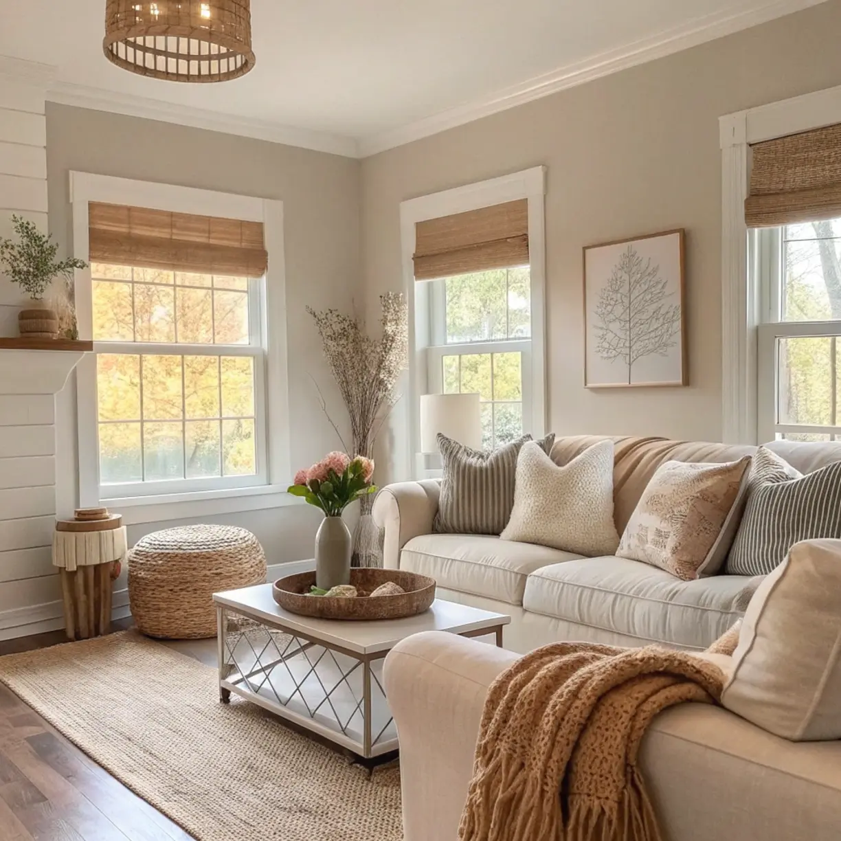
Your living room’s decor style should guide your paint color selection, creating a cohesive look that feels intentional. Different styles call for different palettes:
– Modern minimalist: Opt for crisp whites, soft grays, or muted neutrals that create clean lines and a sense of spaciousness
– Bohemian: Embrace rich terra cottas, deep blues, or verdant greens that add warmth and character
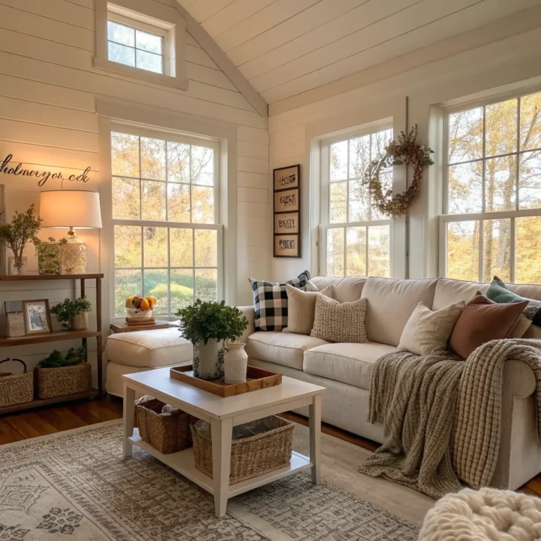
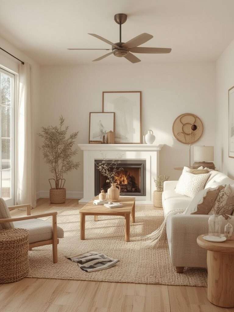
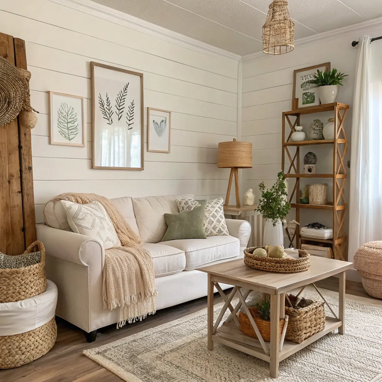
– Farmhouse: Choose soft whites, sage greens, or gentle blues that evoke rustic charm
– Mid-century modern: Consider mustard yellows, olive greens, or burnt oranges for retro appeal
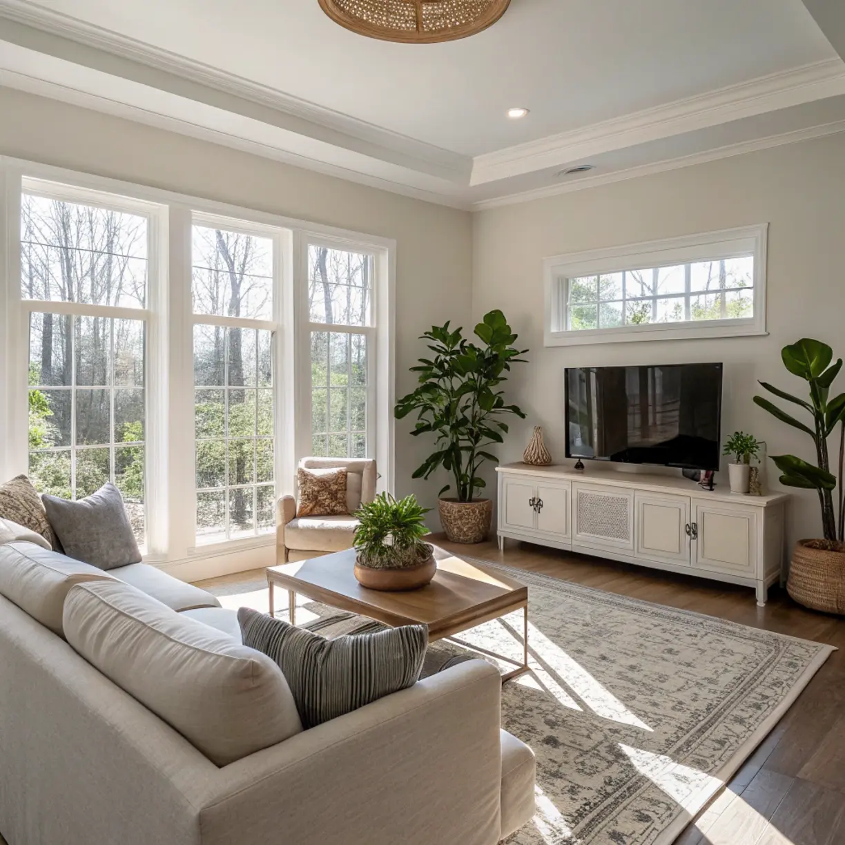
The right paint color enhances architectural features while complementing your furniture. Always consider the natural light your room receives—north-facing rooms benefit from warmer tones, while south-facing spaces can handle cooler hues beautifully.
Essential Decor Tips
When selecting living room paint colors, follow these fundamental principles:
– Test before committing: Paint large sample boards (at least 2’x2′) and observe how they look throughout the day as lighting changes
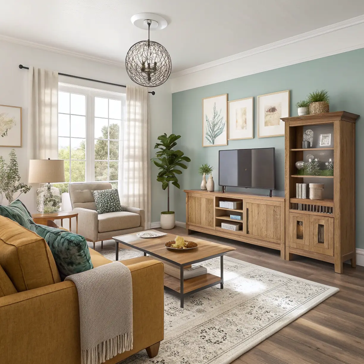
– Consider the color wheel: Complementary colors (opposite on the wheel) create vibrant contrast, while analogous colors (adjacent) create harmony
– Account for existing elements: Your flooring, furniture, and permanent fixtures should inform your color choice
– Use the 60-30-10 rule: 60% dominant color (walls), 30% secondary color (upholstery), and 10% accent color (accessories)
Remember that interior paint color ideas should flow from room to room, creating a narrative throughout your home. Consider cooler tones for a spacious feel or warmer hues for coziness and intimacy.
Budget-Friendly Decor Ideas
Transforming your living room doesn’t have to break the bank:
– Accent wall: Paint just one wall in a bold color rather than the entire room
– Color dipping: Paint the lower third of walls in a contrasting color for a modern look
– DIY color mixing: Purchase a base color and ask for tints to be added at different percentages for coordinating shades
– Quality over quantity: Invest in premium paint for high-traffic areas; it lasts longer and requires fewer coats
– Strategic timing: Shop for paint during holiday sales when prices drop significantly
Stores often sell “mistinted” paints at steep discounts, which can be perfect for your project. Additionally, painting your own trim rather than replacing it can refresh a space for a fraction of the cost.
Common Mistakes to Avoid
Avoid these frequent painting missteps:
– Choosing colors from tiny swatches: Colors look different on a small chip than on a large wall
– Ignoring the room’s lighting: Natural and artificial light significantly alter how paint colors appear
– Selecting overly trendy colors: Ultra-trendy colors may feel dated quickly
– Forgetting about finish: Matte finishes hide imperfections but are harder to clean; glossier finishes are more durable but highlight wall flaws
– Neglecting to consider ceiling color: White isn’t always the best choice; soft colors can add dimension
Many people also make the mistake of not considering the psychological effects of color. Blues and greens promote calmness, while reds and oranges energize—choose accordingly based on how you use your living room.
Lighting Tips for a Better Atmosphere
The interplay between paint color and lighting dramatically affects your living room’s atmosphere:
– Natural light assessment: North-facing rooms get cooler light; south-facing rooms receive warmer light—adjust your color choices accordingly
– Artificial lighting considerations: Incandescent bulbs enhance warm tones, while LEDs with higher Kelvin ratings bring out cooler tones
– Strategic placement: Use wall sconces to wash colored walls with light, highlighting texture and depth
– Dimmers for flexibility: Install dimmer switches to alter the mood and appearance of your paint colors throughout the day
– Reflective surfaces: Mirrors and metallic accents can amplify light and change how wall colors are perceived
The right lighting can make even budget-friendly paint choices look luxurious while creating the perfect ambiance for relaxation or entertainment.
Conclusion
Choosing the perfect living room paint colors is both an art and a science. By understanding your space’s lighting, considering your existing decor, and being mindful of the atmosphere you want to create, you can transform your living room into a sanctuary that reflects your personality. Remember that the most successful interior paint color ideas come from thoughtful planning rather than impulsive decisions. Take your time with the process, collect inspiration, and test samples before committing. We’d love to hear about your living room transformation journey—share your before-and-after photos or questions in the comments below!
FAQs
What colors make a small living room look bigger?
Light, cool-toned colors like soft blues, pale grays, and crisp whites create the illusion of more space. Paint the ceiling the same color as the walls or a lighter shade to heighten the room visually. Avoid dark colors on all walls, which can make the space feel confined.
How do I choose a paint color that complements my furniture?
Look for colors that appear in your existing furniture and accessories. If you have neutral furniture, you have more flexibility with wall colors. For colorful furniture, either choose a neutral wall color that allows your pieces to stand out or select a complementary wall color from the same color family but in a less saturated shade.
Should my living room paint color match adjacent rooms?
While rooms don’t need to match exactly, they should harmonize. Consider using colors from the same color strip (varying shades of one color) or choose colors with similar undertones. This creates visual flow throughout your home while allowing each room to have its own character.
How do paint finishes affect the appearance of color?
Matte or flat finishes absorb light and make colors appear more saturated but show marks easily. Eggshell and satin finishes reflect some light, making colors appear slightly lighter while offering better durability. Semi-gloss and gloss finishes reflect significant light, which can make colors appear brighter but will highlight wall imperfections.
What’s the best paint color for a living room that doesn’t get much natural light?
For darker rooms, avoid cool grays or blues which can make the space feel gloomy. Instead, opt for warm neutrals like creamy whites, soft yellows, or light corals that reflect available light and create a welcoming atmosphere. Adding strategic lighting fixtures can also help brighten the space.