How to Choose 7 Stunning Living Room Paint Colors
Introduction
Selecting the right living room paint colors is perhaps one of the most transformative decisions you’ll make for your home’s interior. The perfect color palette sets the tone, influences mood, and can make your space feel larger, cozier, or more vibrant. Many homeowners struggle with color selection, often feeling overwhelmed by endless options or unsure how to create a cohesive look with existing furniture. Whether you’re drawn to bold statement walls or neutral living room paint colors, this guide will walk you through expert-approved choices that balance timelessness with personality while complementing your unique space.
Table of Contents
Understanding the Best Decor Style
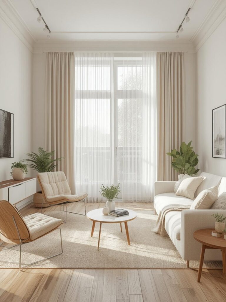
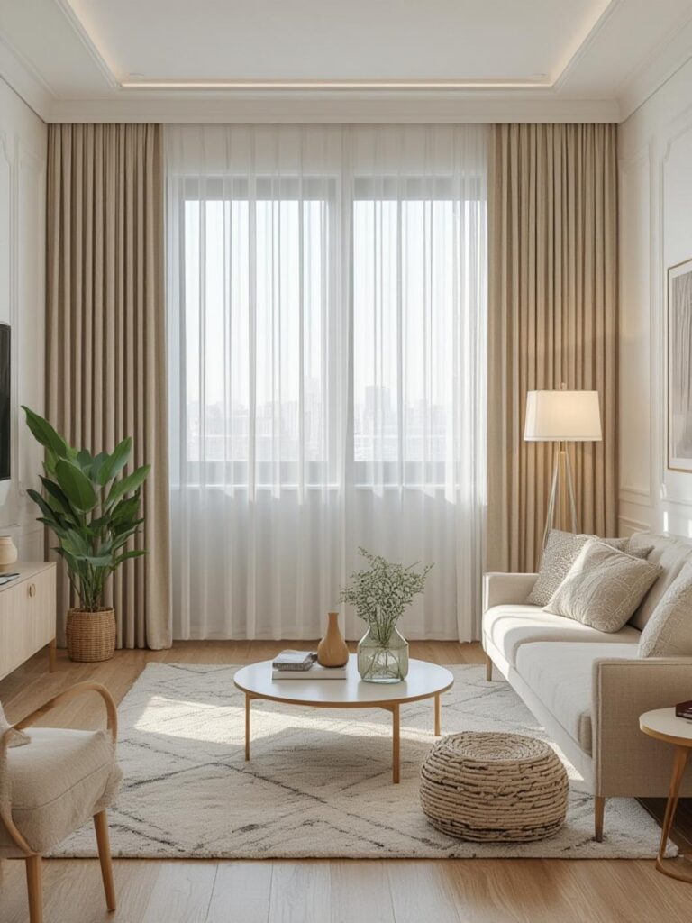
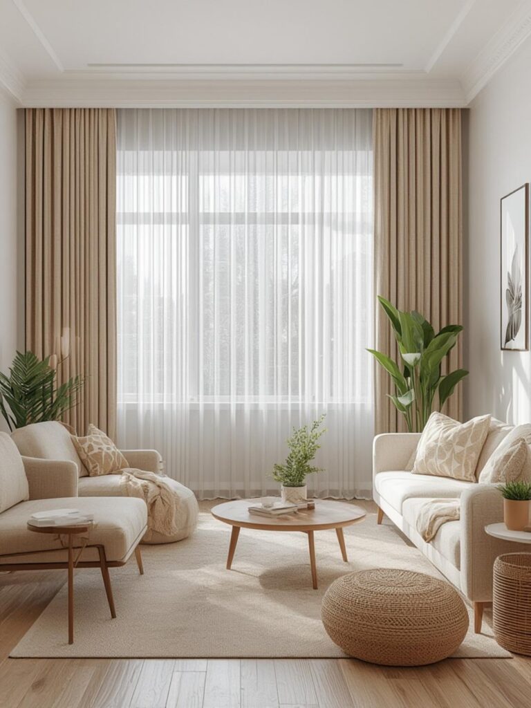
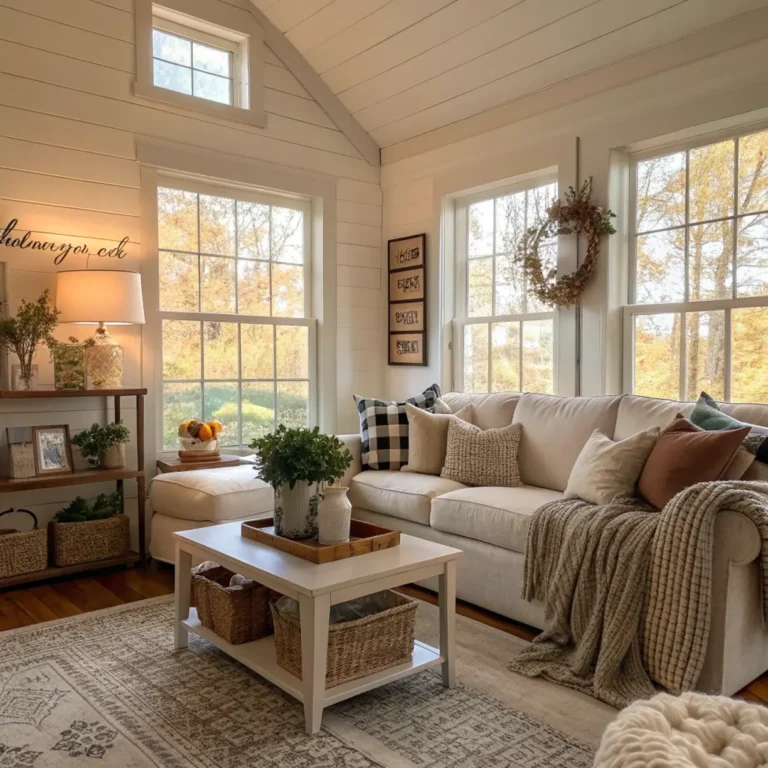
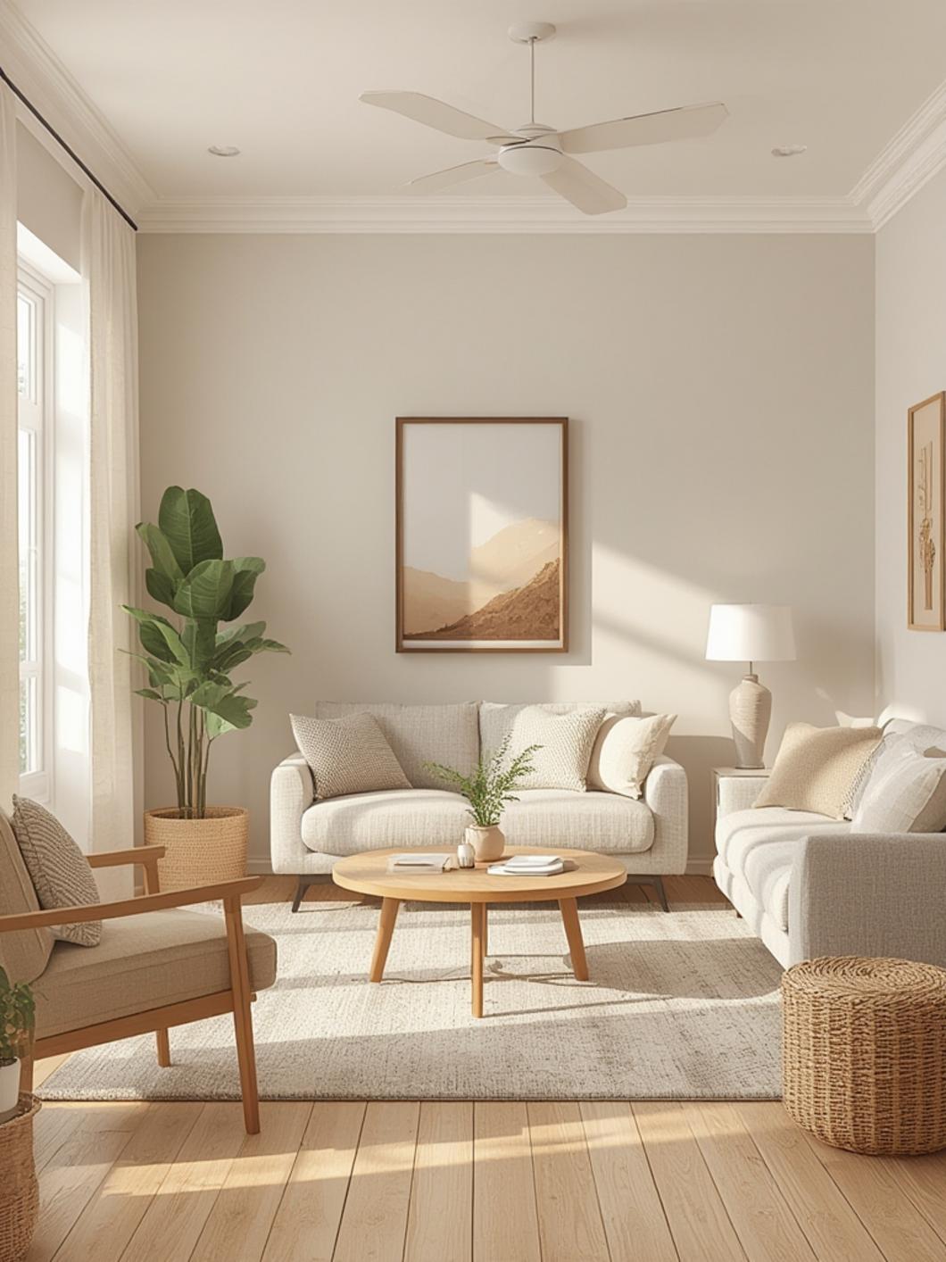
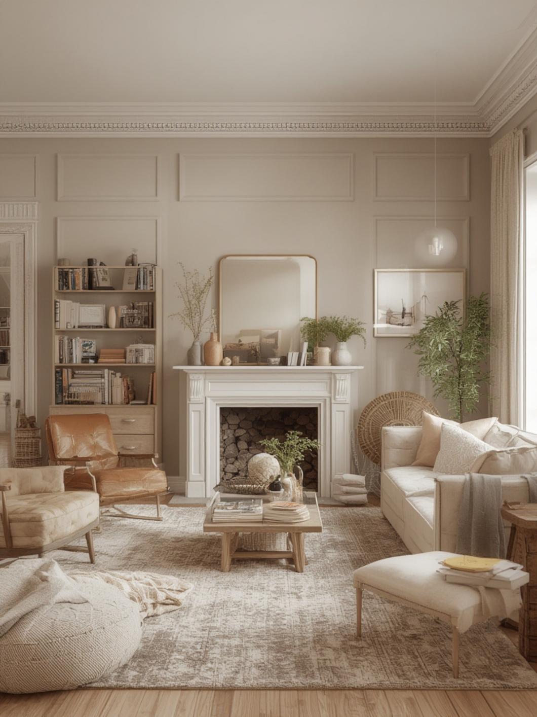
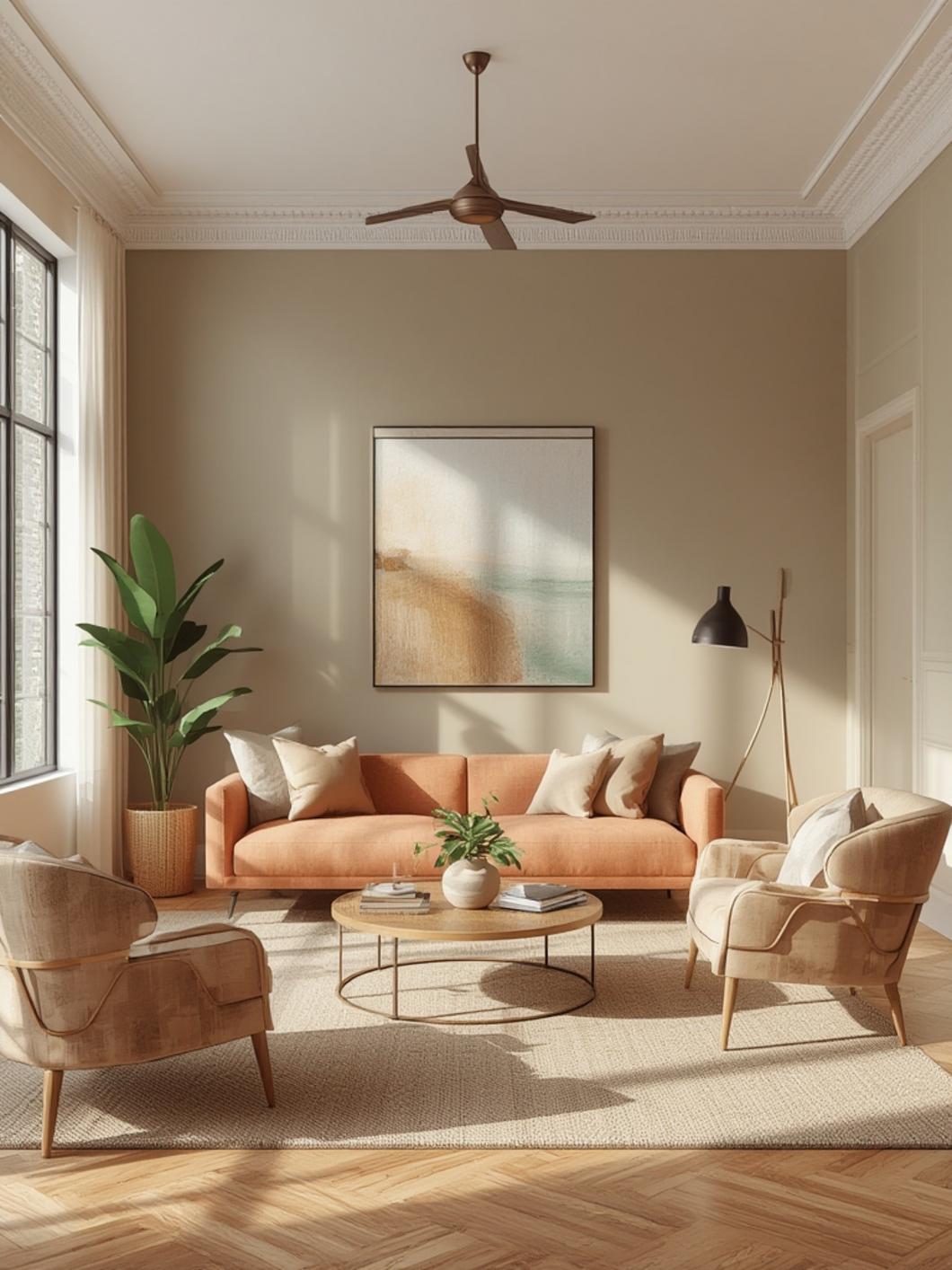
Your paint color selection should align with your overall decor style to create a harmonious living space. For modern minimalist interiors, consider clean whites, soft grays, or muted blues that create an airy, uncluttered feeling. Farmhouse-inspired spaces thrive with warm neutrals like beige, cream, and light sage green. If you lean toward mid-century modern, try incorporating muted teals, mustard yellows, or even a strategic accent wall in burnt orange.
The key is understanding how color affects perception—lighter hues expand spaces visually while darker tones create intimacy. Before committing, assess your natural lighting conditions, as northern-facing rooms benefit from warmer tones while southern exposures can handle cooler colors beautifully. Consider your architectural features too—painting built-ins or trim in complementary colors can highlight your home’s character.
Essential Decor Tips
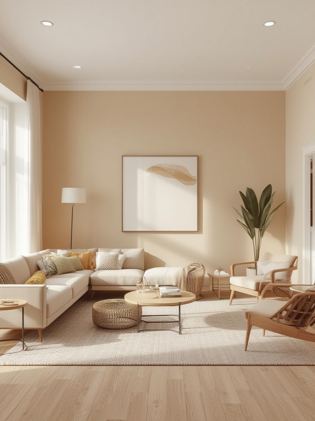
When selecting living room paint colors, the 60-30-10 rule serves as an excellent starting point. This designer principle suggests using your primary color (often neutral living room paint colors like greige or warm white) on 60% of your space, a secondary color on 30%, and an accent color on the remaining 10%. This creates visual balance while maintaining interest.
For cohesion, pull colors from existing elements—perhaps the blue from your area rug or the warm tones in your hardwood floors. Test samples in different lighting conditions by painting large swatches on multiple walls. Observe how they look throughout the day, as natural and artificial lighting dramatically affect how paint appears. Semi-gloss finishes work well for high-traffic areas, while matte or eggshell finishes help hide wall imperfections in older homes.
Budget-Friendly Decor Ideas
Paint delivers the most dramatic transformation for your dollar, making it the perfect budget-friendly decor option. Instead of repainting your entire living room, consider these cost-effective approaches:
– Create an accent wall in a deeper or contrasting shade
– Use leftover paint to refresh furniture pieces or update thrifted finds
– Try color blocking techniques to add visual interest without using much paint
– Incorporate high-quality paint samples (often under $10) to create small decorative projects
Timing your purchase around seasonal sales can save 30-40% on premium paint brands. Many hardware stores also offer “oops paint” (custom colors that weren’t picked up) at steep discounts. For the most professional results without hiring help, invest in quality supplies—good brushes, rollers, and painter’s tape make a noticeable difference in the finished look.
Common Mistakes to Avoid
Many homeowners make avoidable mistakes when selecting living room colors. Perhaps the most common is choosing colors based solely on small paint chips or digital images, which rarely represent how a color will appear on a large wall. Instead, purchase sample pots and paint 2’x2′ swatches on multiple walls.
Another frequent error is ignoring the room’s fixed elements like flooring, stone fireplaces, or wood trim. These permanent features have undertones that can clash with certain paint colors. Similarly, many people select colors without considering their existing furniture—that perfect gray might look dingy next to your warm-toned sofa.
Overlooking lighting conditions is equally problematic. A color that looks stunning in a sun-drenched showroom might appear dull in a north-facing living room. Finally, beware of blindly following trends—while sage green might be this year’s “it” color, only choose it if it genuinely works with your space and personal taste.
Lighting Tips for a Better Atmosphere
The relationship between paint color and lighting cannot be overstated. Even the most perfect shade can appear dramatically different under various lighting conditions. For rooms with limited natural light, warmer whites and creams reflect available light better than cooler tones, which can appear flat or dingy in shadow.
Layer your lighting sources to enhance your paint colors—ambient ceiling fixtures, mid-level wall sconces, and lower table lamps create dimension that highlights wall colors differently at various heights. Consider the color temperature of your bulbs too—warm white bulbs (2700-3000K) enhance reds, oranges and yellows, while cooler bulbs (3500-4100K) better showcase blues and greens.
Smart lighting systems allow you to adjust color temperatures throughout the day, helping your paint colors look their best from morning to night. For evening ambiance, wall-washing light fixtures can dramatize textured paint finishes or highlight architectural details that your color choice accentuates.
Conclusion
Selecting the perfect living room paint colors is a journey of balancing personal expression with design principles. Whether you embrace bold statement hues or prefer neutral living room paint colors, your choices should reflect your personality while creating a harmonious environment. Remember to test samples in your actual space, consider your existing furnishings, and think about how colors will perform throughout different times of day. With these guidelines in mind, you’re well-equipped to transform your living space with confidence. We’d love to see your color transformations—share your before and after photos in the comments below or explore our related posts for more inspiration on home refresh projects!
FAQs
What are the most versatile neutral paint colors for living rooms?
Benjamin Moore’s “Simply White,” Sherwin Williams’ “Agreeable Gray,” and Behr’s “Silver Drop” are exceptionally versatile neutrals that work with virtually any décor style. These shades provide a clean backdrop while offering more warmth and character than stark white.
How do I choose the right paint finish for my living room?
For living room walls, eggshell or satin finishes offer the best combination of subtle sheen and durability. They provide a soft glow that enhances color depth while being washable enough for high-traffic areas. Save flat finishes for ceilings and matte for low-traffic areas.
Should ceiling paint match the walls or stay white?
While traditional white ceilings maximize brightness, painting your ceiling the same color as walls (or a lighter version of the same shade) can make rooms feel more cohesive and cozy. In rooms with tall ceilings, darker ceiling colors can create intimacy.
How do I test paint colors effectively?
Paint large 2’x2′ swatches on multiple walls and observe them for at least 24 hours. Look at them during morning, afternoon, and evening light. Position furniture and accessories near the swatches to ensure cohesion with your existing items.
What colors make a small living room appear larger?
Light, cool-toned colors like pale blue, soft gray, and light greige visually expand space. Consider painting trim the same color as walls for a seamless look that creates the illusion of higher ceilings and greater depth.