Fall Kitchen Decor Ideas: Cozy & Beautiful Ideas for 2026
Fall Kitchen decor , Picture this: it’s the first week of September, and your neighbor’s porch already smells like cinnamon and clove. Meanwhile, your kitchen still has a half-dead basil plant sitting by the sink and a fruit bowl full of summer’s last, slightly sad peaches. Nothing announces “I haven’t caught up with the season yet” quite like that scene.
Here’s the good news: your kitchen doesn’t need a costume change for fall. It needs a mood shift. The kitchens that feel effortlessly seasonal — the ones that look like they’ve been quietly cozying up all along, not like a craft-store aisle exploded across the counter — all follow the same handful of principles. Once you know them, decorating for fall stops being a scramble and starts being a five-minute Sunday project. Here’s exactly how to pull it off in 2026: the colors, the timing, the styling trick every designer swears by, and which trends are actually worth spending money on.
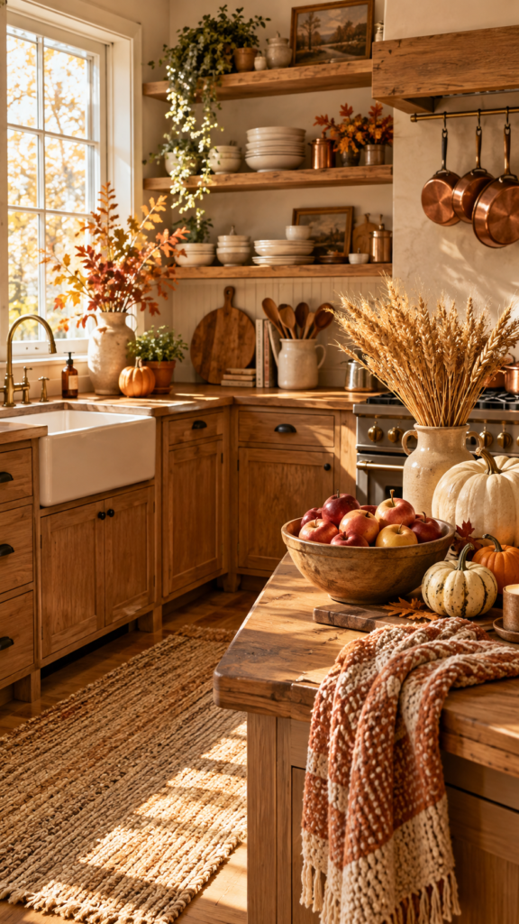
Table of Contents
Key Takeaways
- 2026’s fall palette has moved past pumpkin orange into cinnamon, chocolate brown, and deep plum — colors sophisticated enough to stay up past Halloween.
- The 3-5-7 styling rule (grouping decor in odd numbers) is the single easiest way to make counters and open shelves look intentional instead of cluttered.
- Certain “safe” kitchen choices — stark white, cool gray, and navy blue cabinetry — are starting to read as dated in 2026, in favor of warmer, more textured looks.
- Early-to-mid September is the sweet spot for decorating; anything before Labor Day risks looking premature, and decor should generally come down before Thanksgiving prep takes over.
- The best fall kitchen decor ideas lean into texture and craftsmanship — dried botanicals, stoneware, handwoven textiles — rather than plastic seasonal props.
How to Decorate the Kitchen for Fall (Without It Looking Try-Hard)
Before buying anything, ask a simpler question: what in this kitchen already works, and what just needs a nudge? A theme isn’t necessary. Three or four touchpoints — the counter, the open shelf, the table, maybe the range hood — are enough to do the visual work.
A cutting board leaned against the backsplash with a small stack of linen napkins. A stoneware bowl of pears or pomegranates instead of the summer citrus. A single dried floral stem in a ceramic vase. That’s roughly 80% of a great fall kitchen, and none of it requires a trip to a seasonal pop-up shop.
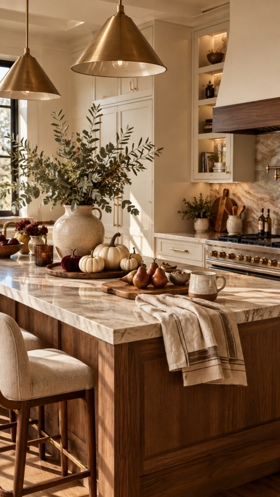
The 3-5-7 Rule, Explained
The 3-5-7 rule is a styling trick that gets used constantly by professionals, precisely because it removes the guesswork. It works like this: display items in odd-numbered groupings — small pieces in sets of three, medium ones in sets of five, larger pieces in sets of seven. The number depends on scale: three larger anchor pieces, five medium supporting pieces, and seven small, personality-driven details like candles or little bowls.
Designers don’t treat it as gospel. They use it because odd numbers naturally avoid the flat, static look of a perfectly matched pair — and they know exactly when it’s fine to break the rule (a pair of matching lamps flanking a window still reads as calm and intentional, not accidental).
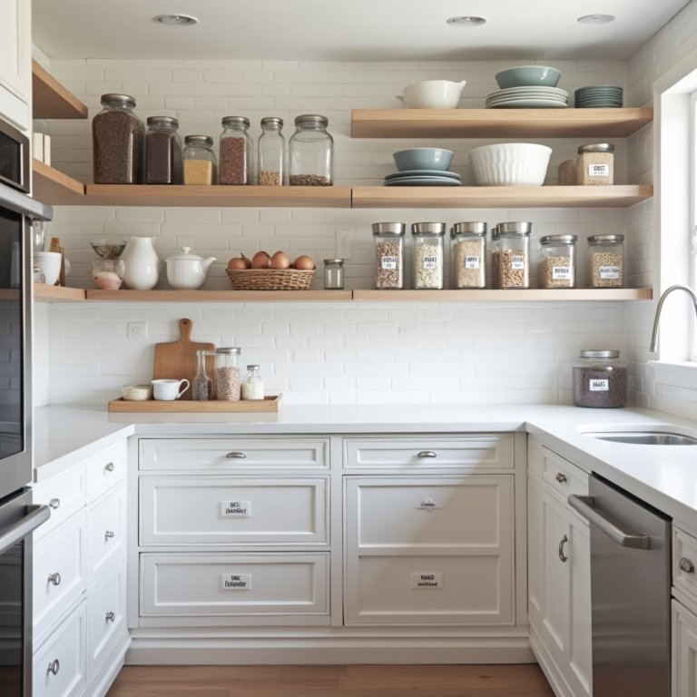
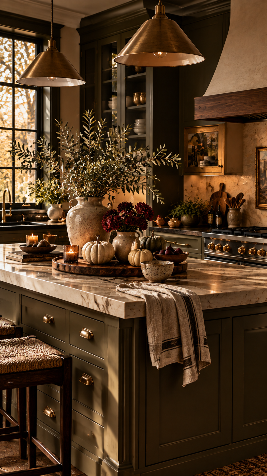
On a kitchen counter, this might mean three small pumpkins of varying heights instead of two matching ones. On open shelving, it’s five items — a stack of bowls, a plant, a candle, a small cutting board, a vase — arranged so the eye travels naturally instead of stopping dead on a straight line.
What’s Actually New for Kitchens in 2026
If an all-white kitchen or a moody navy island happened a few years back, it’s worth knowing this: designers are now calling both “already feeling overdone” and pointing toward warmer, more aged, more textured palettes as the timeless replacement. That doesn’t mean ripping out cabinets — it means seasonal styling is a low-commitment way to soften a look that might be starting to feel a little too safe.
Pinterest’s 2026 fall data backs this up with a real surge toward vintage and statement patterns — fabric, wallpaper, and tile — showing up specifically in kitchens, bathrooms, and laundry rooms. That’s the direction worth leaning into: a runner, a set of patterned dish towels, a vintage-style pitcher. Anything with a jack-o’-lantern printed on it, less so.
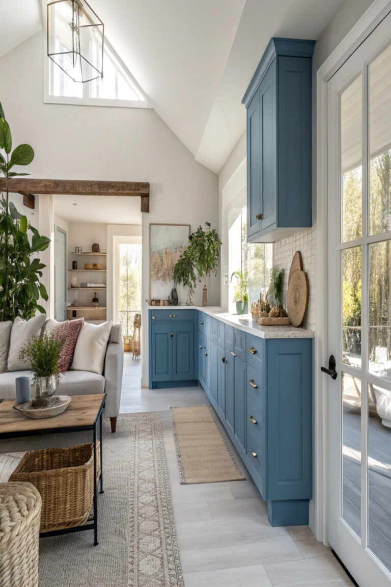
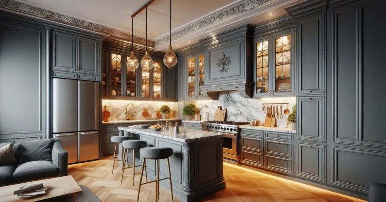
For anyone weighing an actual cabinet update alongside seasonal styling, the industry has landed somewhere specific for 2026. Designers are moving away from stark white, cool gray, and heavy navy blue cabinetry — all three are now called out as the “safe defaults” that read as predictable rather than fresh. In their place: creamy off-whites, soft charcoal instead of flat gray, and warmer earth tones like taupe, olive, and gray-green. Emerald green, once the boutique-hotel darling, is also getting flagged as overused. None of this demands a repaint before fall — but it explains why a warm, textured styling approach feels more current than leaning on crisp white-and-black contrast this year.
What Are the Fall Décor Trends for 2026?
The color story is the single most useful thing to know before buying anything. Where chocolate brown had its moment as a moody, layered look, this year’s real breakout is orange-infused, mid-tone browns — think “cinnamon” — sitting right between warm and genuinely livable. Alongside that, deeply saturated purples are showing up as the other anchor tone for the season.
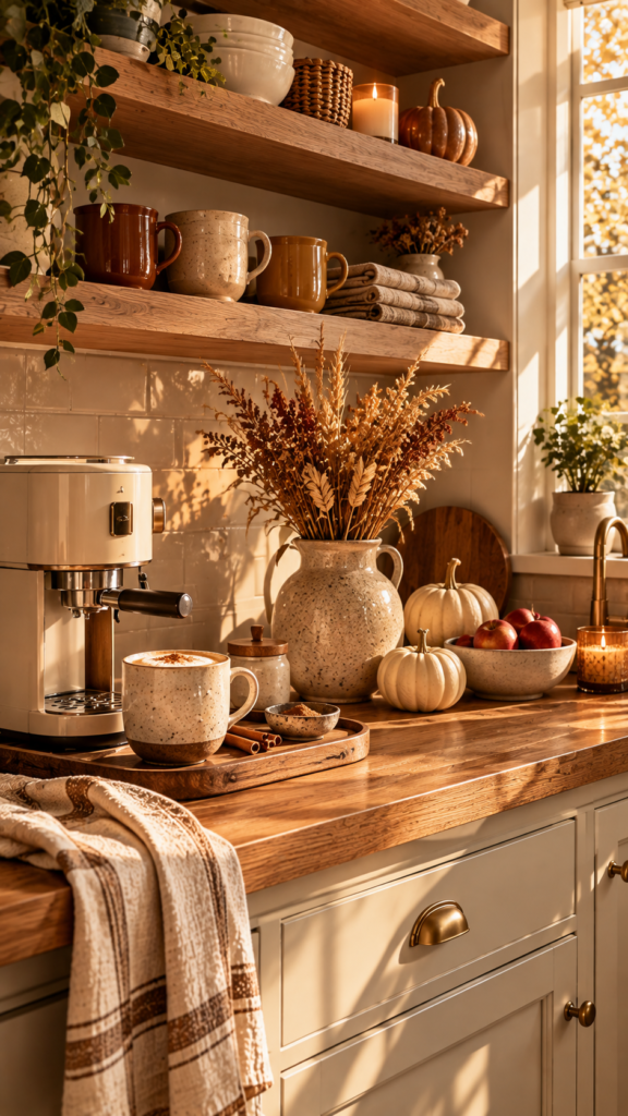
More broadly, designers are pointing to burgundy, plum, chocolate, mustard, and oxblood as the palette of the moment, all in service of a moodier, more intimate autumn feel. The common thread: the colors people are still happy with by December aren’t the ones that scream “seasonal,” but the ones with enough depth to keep working once the leaves are down — a chocolate-brown accent or a simple dusty-yellow cushion can carry a kitchen well past Halloween.
The smart move is picking one anchor color from that list and letting it show up in just two or three spots — a runner, a stack of napkins, a bowl. Resisting the urge to theme the entire room is what separates a styled kitchen from a seasonal display. This year’s trends are really about quiet luxury and artisanal, personal pieces layered thoughtfully, not a full seasonal overhaul.
What Month Should You Decorate for Fall?
This question comes up constantly, usually from someone feeling behind after seeing a neighbor’s porch decorated in mid-August. The honest answer: early-to-mid September is when a fall kitchen starts to feel right rather than early. The air hasn’t turned yet, but grocery stores have — squash, apples, and pears show up, offering a natural, edible way to start the transition before touching a single decorative object.
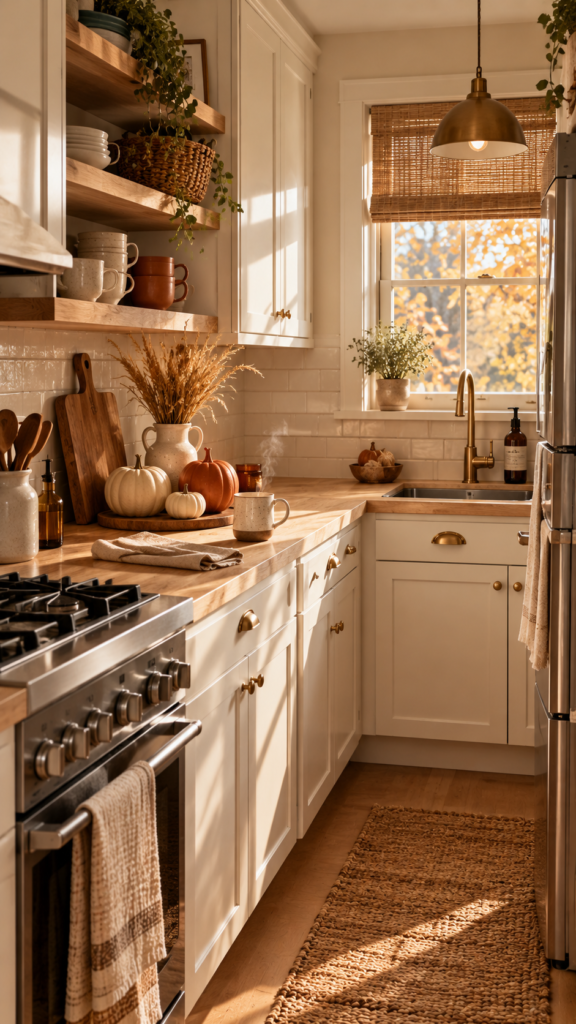
As for taking it down: true “fall” pieces — dried leaves, anything orange-leaning — should come down before Thanksgiving week, since that’s when the kitchen needs to function as a workspace again, not a still life. Warmer neutral tones — cinnamon, plum, stoneware — aren’t season-locked the way a plastic pumpkin is, so they can stay right through the holidays without looking out of place.
Trendy Fall Décor Options Worth Actually Buying
The pieces that hold up all season are warm neutrals rather than neon orange, real dried botanicals rather than plastic ones, and anything sturdy enough to still look intentional after Thanksgiving — not like leftover decorations. That’s the filter worth running every purchase through this year.
- Dried botanicals, real ones. A bundle of wheat or dried eucalyptus in a simple ceramic vase reads expensive. The cellophane-wrapped craft-store version doesn’t.
- Stoneware and matte ceramics in cinnamon, oxblood, or deep plum — a fruit bowl or a pitcher does more work than any themed sign ever will.
- Textured linens — a chunky-weave runner or napkins in a mustard or burgundy tone.
- One “hero” object — a vintage pitcher, a hand-thrown bowl, a brass candle holder — something that could believably live in the kitchen year-round but happens to feel especially right in fall.
The Bottom Line
A great fall kitchen isn’t about how much gets decorated — it’s about restraint plus the right color story. Pick a palette (cinnamon, plum, or a deep chocolate-brown), apply the 3-5-7 rule so it looks curated instead of cluttered, and let real materials do the heavy lifting. Anything that would look embarrassing in a photo come November is worth skipping now.
The best next step isn’t a full overhaul — it’s picking just one idea from this list and trying it this weekend. That’s usually all it takes to make a kitchen feel like fall arrived on purpose.
Frequently Asked Questions
What are the fall décor trends for 2026?
The 2026 fall palette centers on cinnamon (an orange-infused, mid-tone brown), deep plum, chocolate brown, mustard, and oxblood. The overarching theme is “quiet luxury” — warm, saturated colors paired with artisanal, textured pieces rather than a full seasonal overhaul. Vintage-inspired fabric, wallpaper, and tile patterns are also showing up strongly in kitchens specifically.
What is the 3-5-7 rule in decorating?
It’s a styling method where decor gets grouped in odd numbers rather than pairs: three larger anchor pieces, five medium supporting pieces, and seven small detail items like candles or little bowls. Odd numbers read as more natural and dynamic than symmetrical pairs, which is why it’s the go-to trick for making a counter or open shelf look curated instead of cluttered. Designers treat it as a guideline, not a strict rule — even-numbered symmetry still works for things like a matching pair of pendant lights.
What kitchen cabinet colors will look outdated in 2026?
Stark white, cool gray, and navy blue are the three colors designers most frequently call out as feeling dated in 2026, alongside an overuse of emerald green. The shift is toward warmer, more personal tones — creamy off-white instead of stark white, soft charcoal instead of flat gray, and earthy shades like taupe, olive, and gray-green. For anyone not ready for a repaint, warm-toned fall styling is a low-commitment way to soften a kitchen that’s starting to feel like everyone else’s.
What month should you decorate for fall, and when should it come down?
Early-to-mid September is the sweet spot — early enough to enjoy the season, late enough to avoid looking premature. True seasonal pieces, like dried leaves or anything orange-leaning, are best removed before Thanksgiving week, when the kitchen needs to go back to being a workspace. Warmer neutral tones like plum, cinnamon, and stoneware aren’t season-locked the same way and can comfortably stay up through the holidays.