5 Steps to a Stunning Burgundy Bedroom You’ll Love in 2026
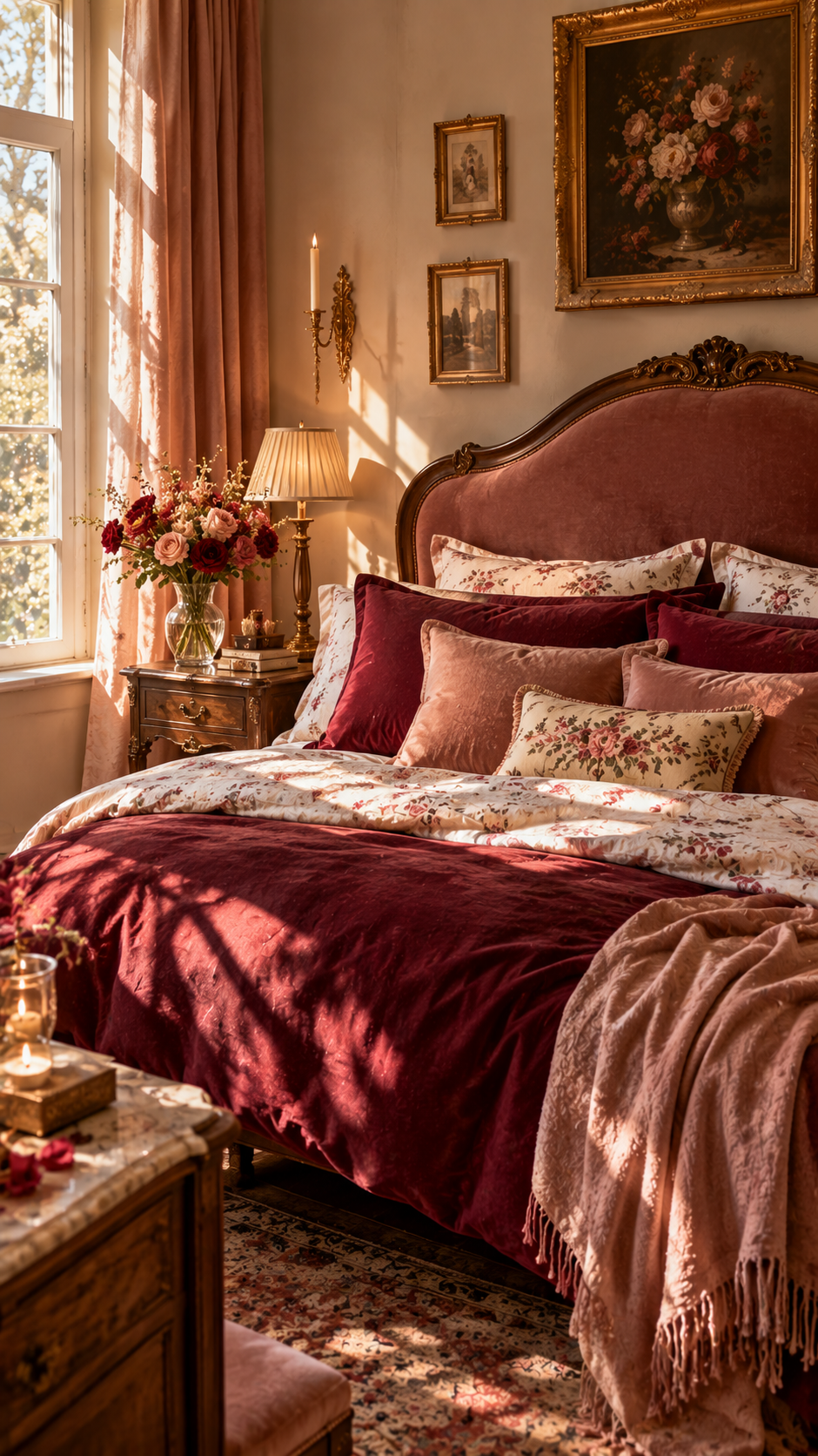
Burgundy Bedroom . A few years ago, burgundy would have been the color your grandmother’s dining room was painted — the one everyone quietly agreed was “a bit much.” Walk into a well-designed bedroom today, though, and there’s a decent chance you’ll spot it: on a velvet headboard, a set of drapes, or a single accent wall that makes the whole room feel warmer the second you step in.
Burgundy has quietly become one of the most requested jewel tones in bedroom design, and 2026’s color forecasts only back that up. Paint brands are moving away from cool, sterile neutrals toward deep, moody, nature-inspired shades — and burgundy sits right in that sweet spot between bold and livable. It reads as rich without feeling loud, and it works whether your bedroom is 120 square feet or a sprawling primary suite.
The catch is that burgundy is not a “throw it on every wall and hope for the best” color. It’s a strong, saturated red-wine tone, and pairing it badly can make a room feel heavy, dated, or oddly like a wine cellar. Pair it well, and it becomes one of the coziest, most sophisticated bedrooms in the house. Here’s how to actually do that, step by step.
Table of Contents
Step 1: Decide How Much Burgundy You Actually Want
Before you touch a paint swatch, figure out your commitment level. Burgundy works at almost any dose:
- Full immersion: Burgundy walls (often just one accent wall behind the bed) paired with lighter furniture and bedding.
- Medium dose: Neutral or warm-toned walls with a burgundy headboard, curtains, or an area rug doing the heavy lifting.
- Light touch: Neutral everything, with burgundy showing up only in throw pillows, a vase, or artwork.
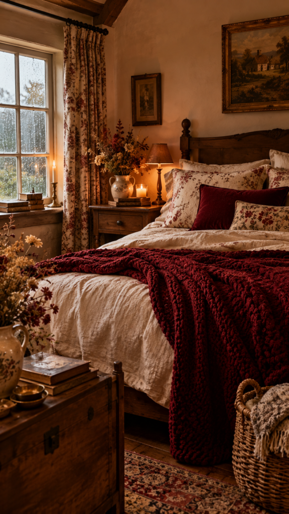
If you’re renting or just testing the waters, start with the light touch and build up. If you already know you love moody, saturated rooms, the accent wall behind the headboard is the classic move — it frames the bed like a piece of art without swallowing the whole room in color.
Step 2: Choose the Right Companion Colors
This is where most burgundy bedrooms succeed or fail. Burgundy is a warm, deep red with brown and purple undertones, so it needs partners that either calm it down or let it shine without competing.
Colors that consistently work well with burgundy in a bedroom:
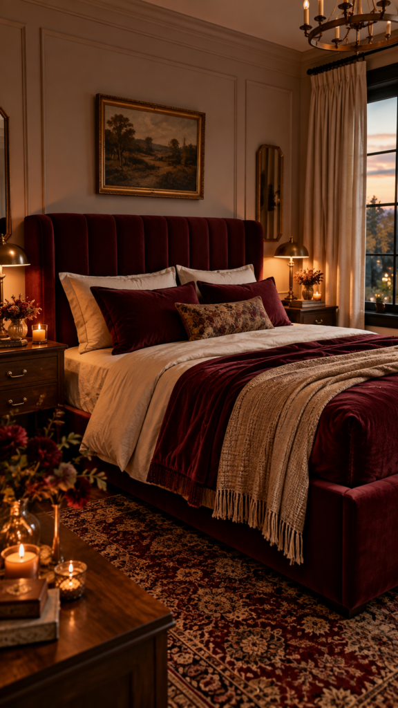
- Warm neutrals — cream, ivory, warm beige, and the honeyed, butterscotch-toned neutrals that are trending hard for 2026. These soften burgundy’s intensity and keep the room from feeling like a single, overwhelming block of color.
- Soft blush or dusty pink — a lighter, cooler cousin of burgundy that adds contrast without clashing.
- Gold and brass metallics — burgundy has always paired beautifully with warm metals; think lamp bases, mirror frames, and drawer pulls.
- Deep forest green or emerald — a jewel-tone pairing that reads as luxurious rather than mismatched, especially in a velvet headboard-and-throw-pillow combo.
- Charcoal or soft black — used sparingly (a bed frame, a lamp, window trim) to ground the room and stop it from feeling too soft or overly romantic.
Colors to avoid or use with real caution:
- Bright orange or true red — too close in temperature and hue; it fights burgundy instead of complementing it.
- Neon or highly saturated brights — burgundy is already a statement color, and pairing it with another loud tone usually just creates visual noise.
- Cool, icy pastels — a very pale, cool-toned blue or lavender can feel oddly clinical next to burgundy’s warmth.
Step 3: Pick Your Accent Colors on Purpose
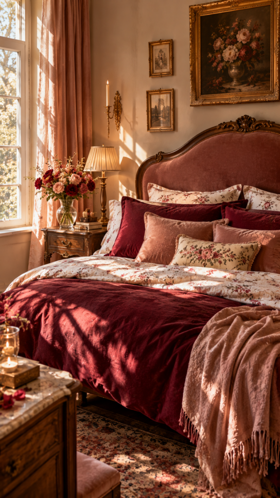
Once your wall-and-furniture strategy is set, accents are where you can have real fun. The best accent colors for burgundy tend to fall into two camps: ones that soften it, and ones that make it pop.
For a softer, more restful bedroom, lean on blush pink, cream, and soft gold. For a bolder, more dramatic look, pair burgundy with emerald green, navy, or even a warm mustard yellow — a combination that’s having a real moment in 2026 as designers move toward richer, more confident color pairing after years of all-neutral “quiet luxury” interiors.
Step 4: Bring In 2026’s Bedroom Trends
Burgundy fits naturally into where bedroom design is heading this year. Major paint brands have all pointed toward warmer, earthier, more grounded palettes for 2026 — a shift away from cool grays and stark whites toward tones that feel intentional and lived-in. That’s good news if you’re leaning into burgundy, because it means the rest of your room’s palette (walls, trim, flooring) is trending in a direction that naturally supports it.
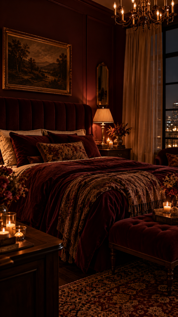
A few other 2026 bedroom trends worth borrowing:
- Warm, tactile materials — velvet, boucle, and heavy linen are replacing sleek, cool surfaces. Perfect for a burgundy velvet headboard or throw.
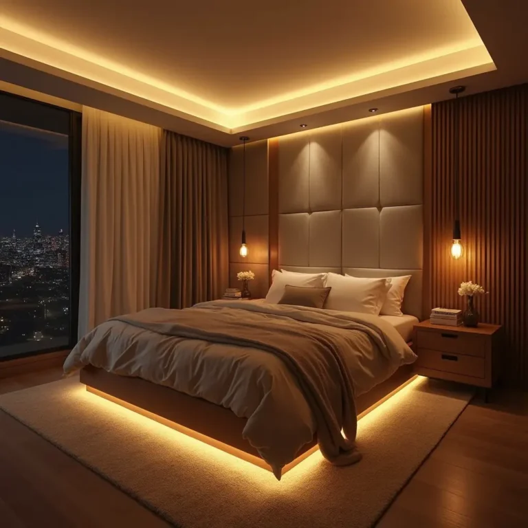
- Layered lighting — a single overhead light is being replaced with a mix of table lamps, wall sconces, and warm-toned bulbs, which flatters deep colors like burgundy far more than harsh overhead light does.
- Curated, not cluttered — the “more is more” maximalist look is giving way to fewer, more intentional statement pieces. One burgundy accent wall or one striking headboard beats five scattered burgundy accessories.
Step 5: Test Before You Commit
Burgundy shifts noticeably depending on lighting — it can look almost brown in warm incandescent light and much more purple-red under cool daylight bulbs. Before painting a full wall, get a large sample board, tape it up, and look at it in your room at different times of day. What reads as “sophisticated wine” at 9 a.m. can look surprisingly dark by evening, so it’s worth the extra day of testing.
Frequently Asked Questions
What colors go with burgundy in a bedroom?
Warm neutrals like cream and beige, soft blush pink, gold and brass metallics, deep forest green, and charcoal all pair well with burgundy. The goal is to balance its warmth and intensity rather than compete with it.
What are the 2026 bedroom trends?
2026 is favoring warm, earthy, nature-inspired color palettes over cool neutrals, along with tactile materials like velvet and boucle, layered warm lighting, and a more curated, less cluttered approach to accessories and statement pieces.
What colors don’t go with burgundy?
Bright orange, true red, neon or highly saturated brights, and cool icy pastels tend to clash with burgundy. These either compete with its intensity or clash with its warm undertones.
What colors accent burgundy?
For a softer look, blush pink, cream, and soft gold work well as accents. For a bolder, more dramatic look, emerald green, navy, and warm mustard yellow make burgundy pop rather than recede.
Recommended Product Categories
| Category | Why it fits | Typical Amazon search terms |
|---|---|---|
| Velvet headboard / bed frame | Ties to Step 1 (“full immersion” or “medium dose”) | “burgundy velvet headboard“ |
| Throw pillows & pillow covers | Cheapest entry point — great for “light touch” readers | “burgundy throw pillow covers“ |
| Bedding set / duvet cover | High-intent purchase, easy to swap seasonally | “burgundy duvet cover set“ |
| Area rug | Anchors the room, good price range for affiliate commissions | “burgundy area rug bedroom“ |
| Curtains / drapes | Reinforces Step 2 (companion colors) | “burgundy blackout curtains“ |
Bringing It All Together
Burgundy isn’t a trend that showed up overnight, and it’s not going anywhere in 2026 either — it’s simply too versatile to fade out. Used with the right neutrals, the right metals, and a little restraint, it turns an ordinary bedroom into a room that feels genuinely designed rather than decorated.
Start small if you’re unsure: a burgundy throw, a set of pillows, one lamp. If it grows on you the way it does for most people, you’ll likely find yourself reaching for that paint swatch sooner than you expected.
Thinking about trying burgundy in your own bedroom? Share your starting point in the comments — accent wall, headboard, or just a few accessories — and we’ll help you figure out the best way to build it out from there.
This post contains affiliate links. I earn from qualifying purchases.